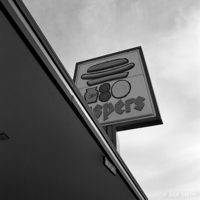
Caspers Famous Hot Dogs - Oakland
 |
| "Caspers, Oakland No. 1" |
Nothing makes me think of home more than the graphics of a Caspers Famous Hot Dogs ® sign. The black outline around the dog, buns and condiments are a perfect accent around the three dimensional visuals that physically pop out of the plastic. And the bratwurst Deutsch Gothic type font without a possessive apostrophe makes this a perfect visual for me.
The logo reminds me of the work of Paul Rand, David Weidman or James Flora - three of my favorite mid-century graphic designers and illustrators. The visual message is no nonsense. When you come to Caspers, this is what you get. Although I only take my dog with relish and mustard with the occasional addition of sauerkraut, the round tomatoes and onion slice balance out the horizontal lines of the dog and buns.
This 6T's graphic was a staple of my childhood. I grew up a few blocks aways from this Caspers on Telegraph Avenue in Oakland and went to nursery school down the street. I'm glad to see that the building and it's respective sign is still standing in the quickly changing demographics of Oakland and I look forward to presenting to you the remaining Caspers locations in future blog posts.
Enjoy a "snap" in every bite,
Julie Green
April 16, 2016
 |
| "Caspers, Oakland No. 4" |
 |
| "Caspers, Oakland No. 6" |
 |
| "Caspers, Oakland No. 7" |
 |
| "Caspers, Oakland No. 8" |
Craving a hot dog now!
ReplyDelete