Skip to main content
Search
Search This Blog
Patterns and Tones
A blog on the art created by Julie Green
Posts
Showing posts from December, 2013
Show all
Posted by
Julie Green
December 28, 2013
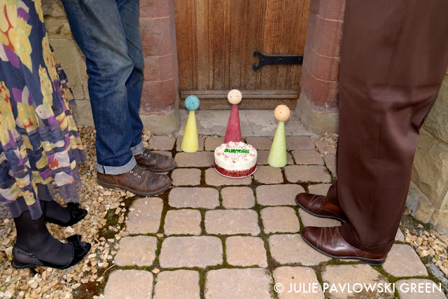
The Last Page
Posted by
Julie Green
December 21, 2013
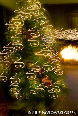
A Honeycomb Kind of Kristmas
Posted by
Julie Green
December 14, 2013
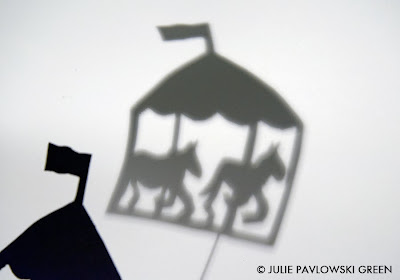
"Fleeting Perspectives: A Paper Ballet" Part 7
Posted by
Julie Green
December 07, 2013
Patterns and Tones Print Sale!
Newer Posts
Older Posts
Home