Primary Colors: A Love Affair

"Color is the keyboard, the eyes are the hammer, the soul is the piano with the strings"
Color. It's all around us. It has served our species well to understand and decipher the inviting shades and warning signs represented by color. Our perception of color is based not just on our visual interpretation and the juxtaposition of different colors together but our emotional and social cues we have attached to specific colors throughout our lifetimes. These social color codes are inherent in societies and helps to bind a culture together.
Color is allusive and fleeting. Like photography, it cannot exist without light. Like music, it is a universal language that can convey a multitude of feelings in a single instance. The subject of color is so vast and interesting that from time to time I will come back to color and explore its interrelationship with emotion, music, science, vision, psychology, culture and other elements that intrigue me. Today, I wanted to discuss my initial love affair with color, in the form of the Primary Colors.

I didn't start creating images with color film until the early 90's and then it was only on certain occasions. My visual baby steps took place in black and white. This may be part of the mystery of why I am draw to the most basic palate of the color wheel: red, blue and yellow. I began to experiment with color in my photography for the emotional impact it provided. This can be seen in Modern Merry Pranksters. It was only until I started shooting commercially did I fully employ color in my work. Black and white provided the basis in which to clearly see composition but color filled it with vibrance and subtleties that were already symbolically filled with emotion and vibrations. I even did quite a few paintings during this period in red light to cut out seeing color, so I could focus solely on texture and composition.
Fashion and music also played a big part in steering my visual grammar. Since I can remember, I have been into the 6T's aesthetic and was actually quite involved with the 80's mod scene in San Francisco. Paper dress worn in the 80's, inspired by Yves Saint Laurent dresses in the 60's, which were inspired by Piet Mondrian's paintings from the 20's, were to be found. I grew up with the pulsating psychedelic colors that filled Berkeley and my Mothers muumuu's in the late 60's and early 70's but my eye was always drawn to the rudimentary colors that were seen daily in the aisles of the supermarket and advertising signs.

My favorite artists have always addressed the inherent nature of color and created their own color vocabularies. Picasso's blue period, Van Gogh's yellows, Piet Mondrian concept of neoplasticism, Joseph Albers and his "Homage to the Square", Kandinsky and his views on emotions inherent in color - all of them addressed the visual impact and implications color had on the work they created.
Yet it is the palate of primary colors which the Pop Artists utilized in the mid to late-1950's, that resonates the most with me. They speak to me. Primary colors are not boring. They wake you up and demand your attention. They are independent entities that are bold, since they know all other color are secondary. When presented in their purest form on the same plane, red, blue and yellow evoke excitement and entertainment. The circus tents and fun houses are always painted in primary colors. The fun factor is not lost on them...
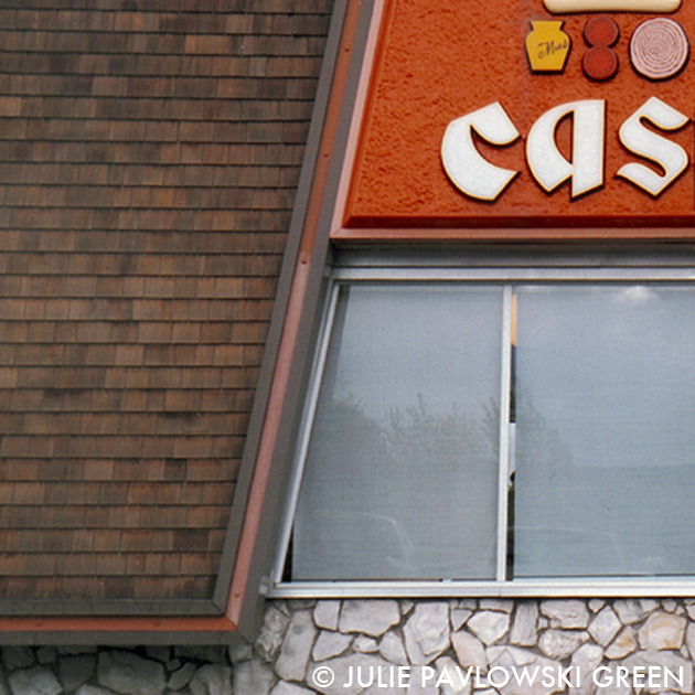
The images presented here are apart of an ongoing series I have been shooting for years on the colors and shapes of fast food restaurants. I am drawn to their brightly colored roof tops that can clearly be seen for miles away, whetting your palate for a burger, pizza, hot dog or shake. It was an era that really understood and exploited the psychology of color and its relationship to food.
Can you believe Orange is supposed to be the dominant color that makes you hungry? Perhaps that is why, besides primary colors, orange is my favorite hue! (It is also an incredibly cool word - the way it sounds, the letters visually look good together... but I digress and promise to discuss my passion for letter signage, fonts and typeface in the future!)

Marketing strategists make it their job to understand our societies psychology and reaction to color, to sell items specifically targeted to elicit emotion. These fast food restaurants are no exception. The blue and white combination of a Foster Freeze evokes a cool milk shake, creamy and ice cold. The red roof tops of a Pizza Hut remind me of hot slice of pizza topped with pepperoni. Mmmm... I'm getting hungry already!

Julie Pavlowski Green
April 6, 2013
"Three cheers for the lowly termite, who brings the circus tents to town"- Julie Pavlowski Green
Comments
Post a Comment